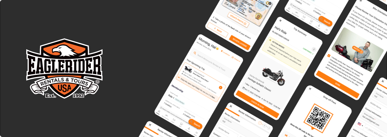
Post Reservation UX Case Study

Overview

Our goal is to gain insight into the user journey after booking a bike and completing pickup and drop-off. Moreover, we aim to gain a deeper understanding of how users interact with the product, uncovering potential pain points throughout the experience.

Role
Research, High Fidelity Design, Prototyping, Front end Dev, Backend Development
Tools

Research

Research Questions

  • Determining if the EagleRider Check In is easy to use
  • Identifying reasons why customers are using the app

Research goals

  • What insights can we gain from user flow for check in.
  • How long does it take for a customer to reach the destination?
  • Do the visual elements in the app support the customers in navigating through the app?

KPIs

  • User Error Rate
  • System Usability Scale

Methodology

  • Moderated Usability Study, conducted remotely with a UX designer supervising.
  • Location: Egypt, United States, remote (each participant will complete the study in their own home)
  • Date: Sessions will take place on February 7 (normal business hours) and February 9 (after hours)
  • Length: Each session will last 10 to 15 minutes, based on a list of prompt

Participants

Participants are Developers and QA Testers of ER application

Script

Introduction:
“Hi, how are you today? Thank you very much for taking the time to talk with us and share your opinions.
I’d like to confirm that you’re okay with the session being recorded. Do I have your permission?
I’ll start with a few questions, and then I’ll give you some tasks to complete while using the app. Your feedback and comments are really valuable for our team, and we’ll use your recommendations to make future improvements to the app to provide users a better experience. Please feel free to share your thoughts honestly, and keep in mind that there are no right or wrong answers.

Do you have any questions about the session before we start?
….Great! Let’s get started.”
Tasks

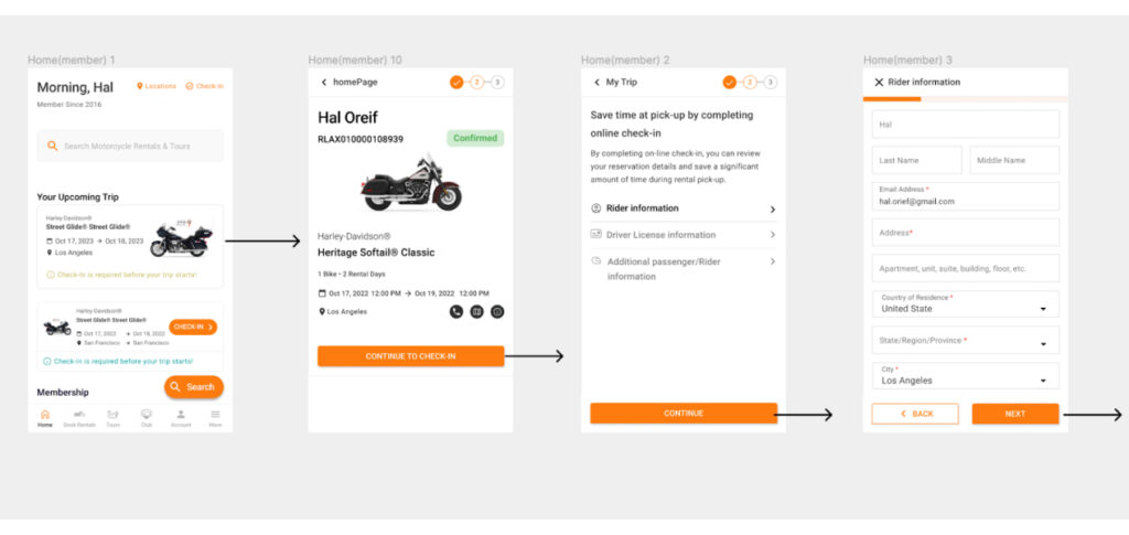
  1. “For the first task, I’d like you to open the app, and complete the check in process
  2. Follow-up Question: Did you find the task easy or difficult to complete? Is there anything you would change about the process of completing the check-in and pickup process?
  3. “For the second task, I’d like you to open the app, and show me how you’ll get to the QR code for the pickup.”
    Follow-up Question: Did you find the task easy or difficult to complete? Is there anything you would change about the QR code page?
  4. Wrap-up questions and closing remarks:
    Well, these are all the questions for today. Thank you again for taking the time to speak with me, and for sharing your honest thoughts about the app. We’re always exploring ways to improve the service for customers, and your input today has been very helpful

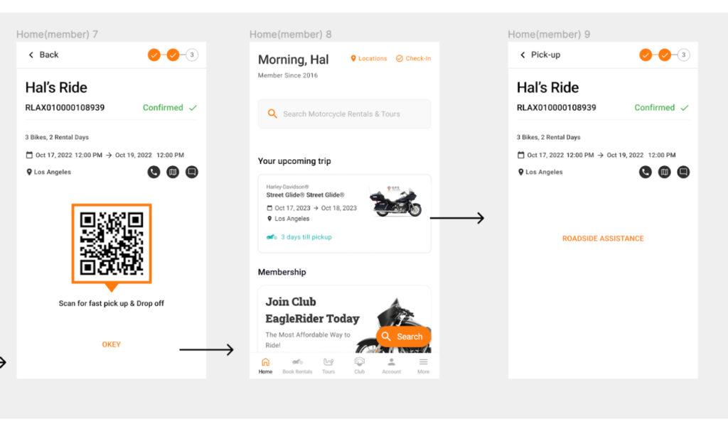
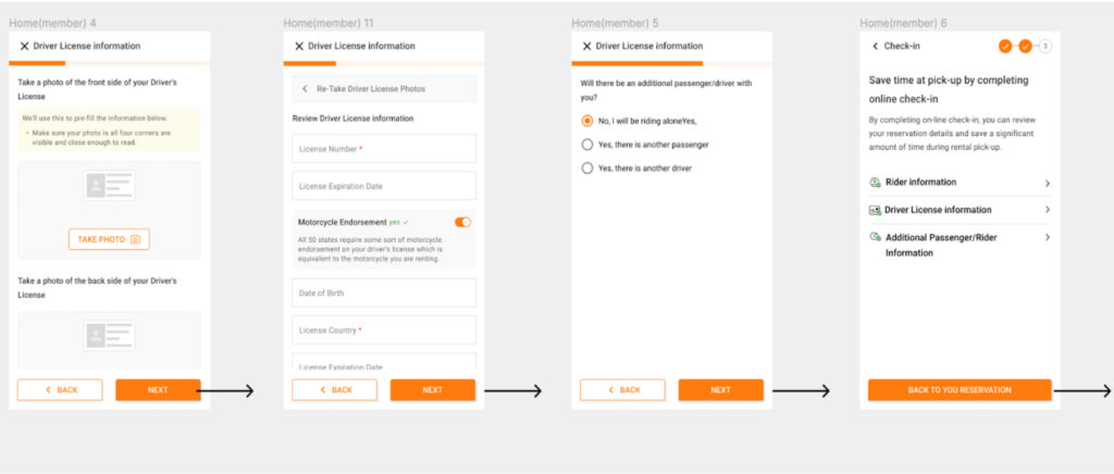
Initial Design

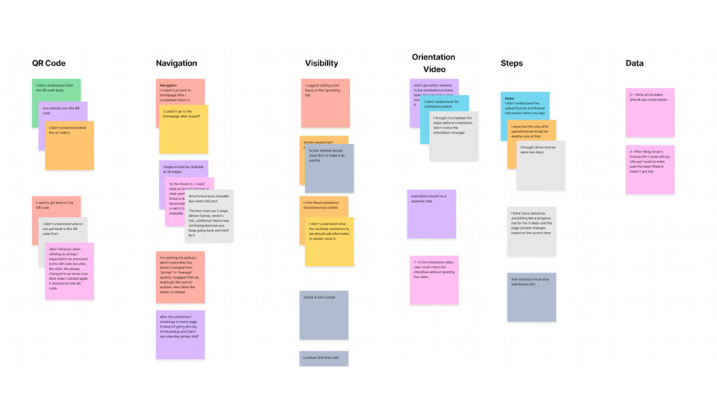
Insight Identification

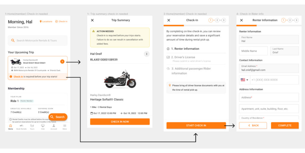
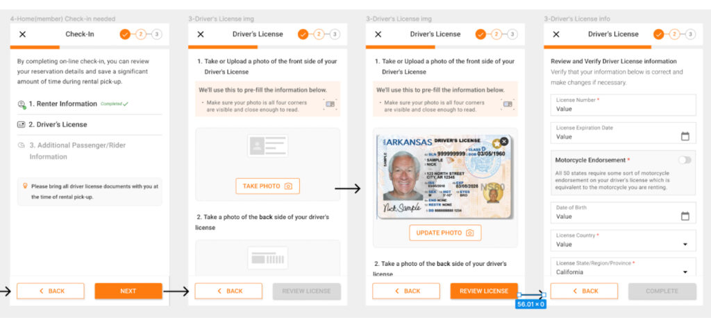
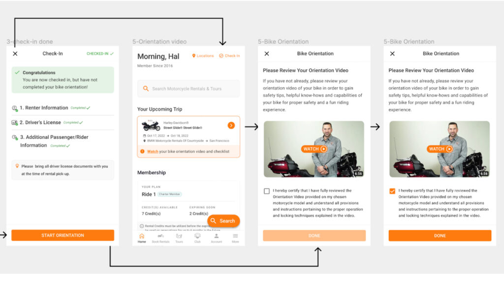
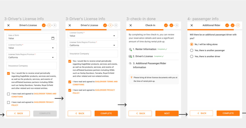
  1. Most of the participants missed that they need to complete the check-in step, an insight is: users need to see an alert notifying them to complete the check-in step .
  2. For most participants was lost and couldn’t find what to do before the trip start, an insight is: users need to receive an email with check-in instructions
  3. There was no location contact information after completing the reservation an insight is: (users need to see location contact information reservation summary ).
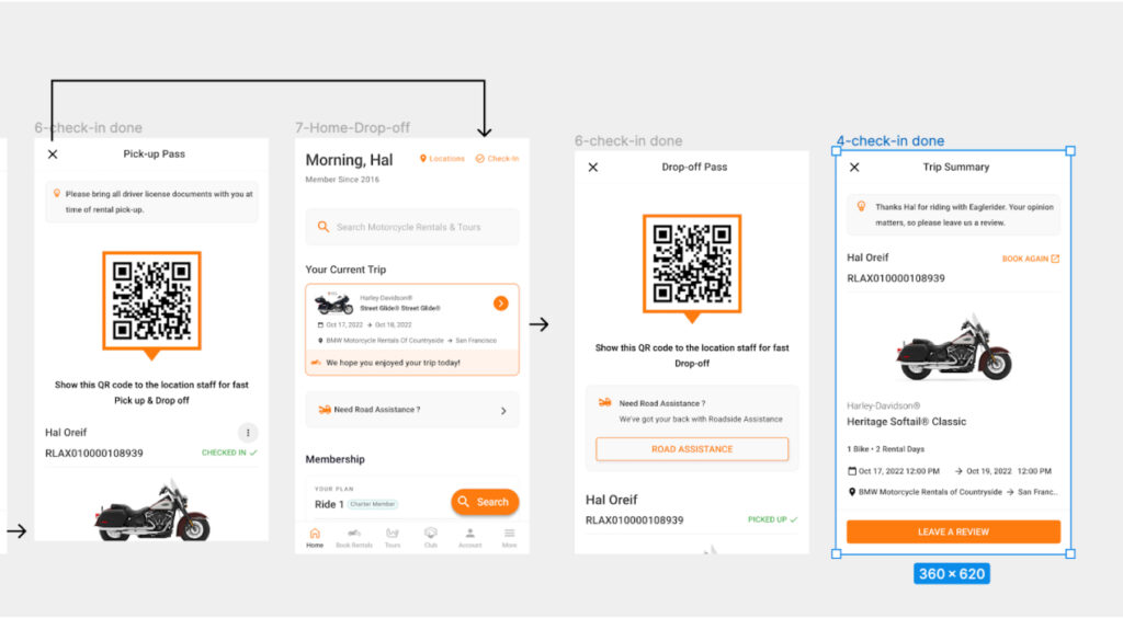
  4. Most of the participants were confused couldn’t find their pick-up information, an insight is: users need to see their upcoming reservation summary on the home page
  5. Most of the participants couldn’t understand the QR code, an insight is: users need to understand the purpose of the QR code
  6. Some participants were confused couldn’t find their pick-up information, an insight is: users need to see their upcoming reservation summary on the home page

Final Design